Improving Sales Journey
at Aussie Chef Clothing
Client
Aussie Chef Clothing Company
Solo UX Designer - 2023
End-to-end project over 6 months
Role
Research, design & handover website redesign optimised for desktop & mobile
Aussie Chef management tasked me, as a design contractor, to take on the complete redesign of their existing website, when an outsourced design team failed to meet their expectations.
First stage, research customer pain points with existing website and issues with Magento back-end software.
Second stage, research direct and indirect competitors, their customer sales journeys and design aesthetics.
One of the main issues for Aussie Chef's exisiting website was Magento software needed a major upgrade.
Coupled with a poorly built backend was resulting in an increasing number of abandoned carts and problems with payment gateway transactions. Additionally, the overall design was old, tired and dated.
Customers seek an easy to use, seamless purchasing experience from product selection to checkout.


My research relied heavily on analysis of the main direct competitors in the Australian market, smaller boutique competitors in the hospitality industry, indirect overseas companies as well as larger corporations like Amazon. What they did well and not so well in terms of the user's experience from homepage to category, from individual product selection to shopping cart and checkout.
Indirect analysis in consultation with the stakeholders, was carried out on fashion e-commerce websites that also use Magento back-end software to define what was possible from a design and development perspective.
Working cross-functionally with developers, research was undertaken to uncover what design parameters were possible without changing the intricate coding of the Magento software checkout templates to minimise issues.
Aussie Chef's main customers are in the hospitality industry, from individual chefs to entire restaurant teams - both front and back of house. However, increasingly customers stem from other industries, schools, universities, franchises and businesses. Plus, Aussie Chef's business model also includes authorised distributors.
Key insights from the research, helped me focus on the most important user issues to address in the redesign.
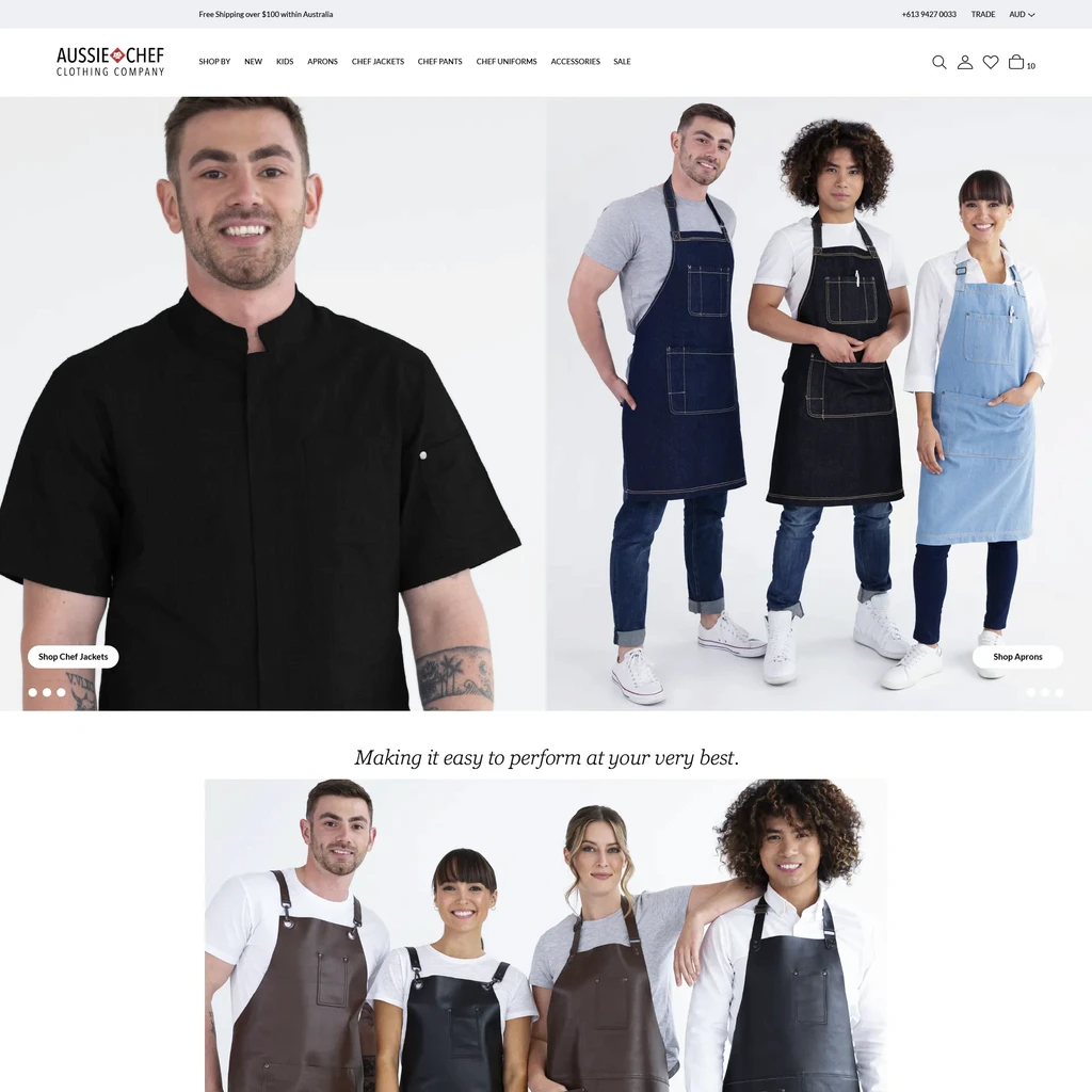
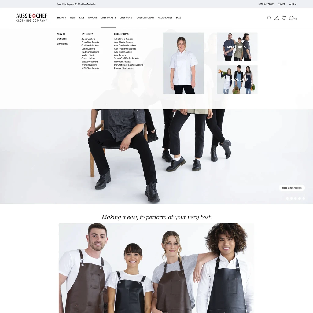
The UI design began with simple wireframes, but on the insistence of the main stakeholders, hi-fi wireframes were used to create the framework and iterations were carried out on the go.
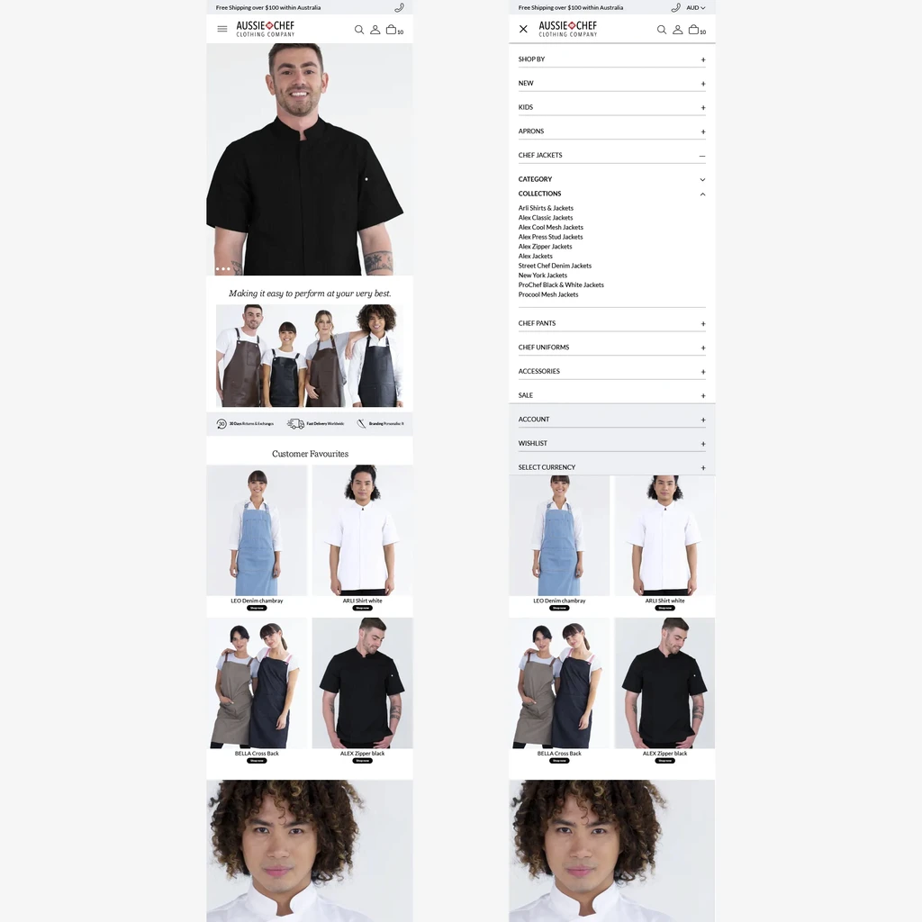
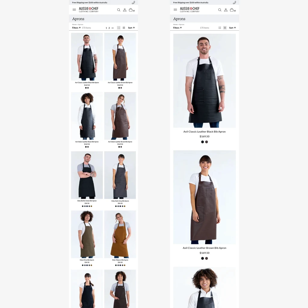
Clear Navigation | Multiple Product Views | Easier Purchase Flow | Clear Checkout Process | Mobile Optimisation
My Account Features | User Help Topics
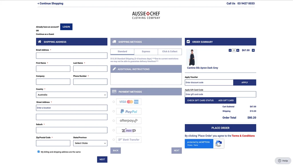
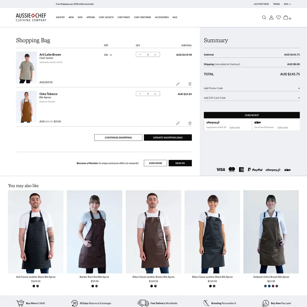
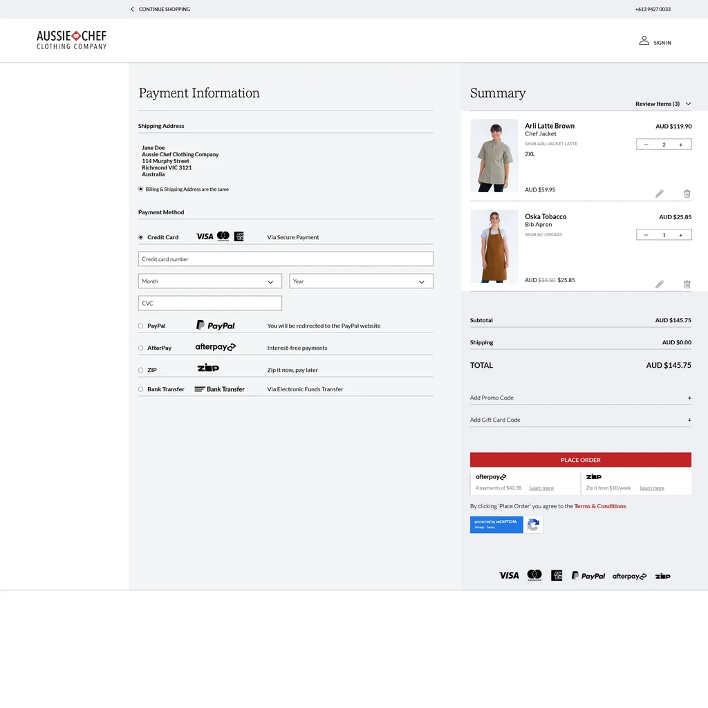
Following a customers journey
The most important part of an e-commerce website is a customers journey - navigating the menu, choosing products, adding to the shopping bag, reviewing selections and checking out. This process needs to be clear, easy to navigate and understand. There needs to be a clear path forwards and backwards so the user does not feel overwhelmed or lost.
Help topics need to be easy to find and navigate - my account, size guides, branding, shipping, returns, terms, catalogues.

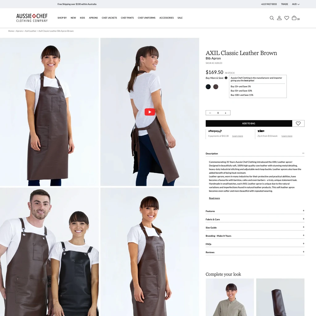
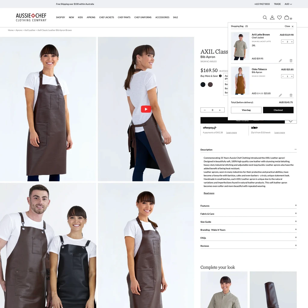
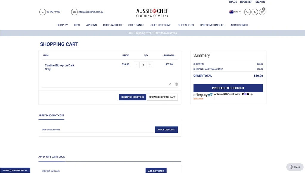
Minimising abandoned cart
Customers abandon their cart or shopping bag for various reasons - wanting to know the total cost, comparing similar products on multiple sites or simply are not ready to buy.
BUT when the shopping cart and check out are confusing or not working optimally, customers give up and leave.
It was imperative that this area of the old website be fixed. I needed to make sure it was easy and simple to navigate and most importantly working correctly. Working cross-functionally, balancing what stakeholders wanted and best practice with developers to achieve a new and improved check out experience.


Test, iterate & test again
As time was of the essence, work on the website redesign became more agile. User testing with key stakeholders, staff, development team and myself began as major areas of the website were finished for both desktop and mobile views, even while auxiliary pages were being finished.
Testing was carried out pre-launch on the staging site - critiquing design criteria, testing functionality and usability. Many minor iterations were made on the UI and the development side, to make sure the user flows worked properly and could be completed successfully.
It was exciting to see the UX and UI come together through the development into a fully functioning website.
It was now time to take it LIVE and test it with the Aussie Chef customer base.
A better customer experience
Time to launch the new website!
Right from that first day, purchases came through seamlessly. Most importantly, abandoned carts decreased significantly, approx 60% in the first month, and sales increased, confirming earlier discussions that the problems were related to the older unsupported version of Magento and the dysfunctional shopping cart and checkout.
Positive reviews also began to flow in from satisfied customers, about the ease of their shopping journey and the improved website navigation and look.
Visit website
My thoughts & reflections
This project ignited my desire to transition into being more involved in UX Design.
To research what is most important in each user experience scenario, to ideate and test initial thoughts, while keeping the user central in designing every step of their journey.
The most important aspect of a good website is whether or not the user's journey is easy and intuitive.
Websites can have beautiful or clever design elements, but if the user flow is confusing or difficult to follow,
it fails its purpose.
Secondly, it is a balancing act between what the stakeholders want to achieve, what the research is telling us, the timeframe and budgets, creating interesting UI that compliments the user experience, while making sure it is viable from a development perspective
.
Thirdly, towards the end of the project, some of the auxiliary areas of the website were rushed, and I received less feedback. I feel these areas could be improved upon in future iterations to create a more cohesive experience.
The website is a work in progress, whether its adding additional value to the users journey, rethinking a design element or making modifications. This involves cross-functional planning between all members of the team.
And that's not all…
Designing the UX for the Aussie Chef website is the highlight of my position at Aussie Chef.
As their senior graphic designer I produce and create all design assets - hero banners, videos, icons, category
and product images. I also write the content - product descriptions, blog entries and product catalogues.
I work to tie all parts of the Customer Experience together - eDM campaigns, social media - to the website.
Learn more
Next case study